classic
/ˈklæsɪk/
adjective
1. of the first or highest quality, class, or rank
2. of enduring interest, quality, or style
noun
1. a work that is honored as definitive in its field
(via dictionary.com)
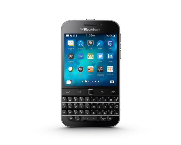
BlackBerry changed the face of the wireless communication industry with its products, and, in doing so, cultivated a devoted following of staunch supporters. The hardware BlackBerry Keyboard was and is second to none, and it is largely for this reason that many still prefer to carry a BlackBerry. The latest BlackBerry handset is indeed, by definition, a Classic, combining the best of several generations of QWERTY BlackBerry devices into a beautifully-balanced package. You want the perennial best keyboard in the industry? You got it. You want the precision of the optical trackpad from your 9700/9800/9900? You got it. Bigger, better touchscreen display? Check. Tool belt with physical call and menu buttons? *CLICK* check. The Classic features sheet reads like a wish-list from long-time BlackBerry road warriors from all walks of life.
Specs
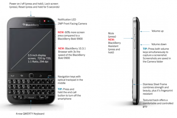
The Classic shares the majority of its specs with the Q10, so I won’t spend much time on detailing them. The few notable exceptions are:
- Expandable memory – Up to 128GB for the Classic, up to 32GB for the Q10.
- Since the Classic features a non-removable battery, the SD card and nano-SIM are in removable trays on the left bezel.
- Battery – 2515 mAH, non-removable for the Classic, 2100 mAH, removable for the Q10.
- Data Port – The Classic has a single micro-USB port located on the bottom of the device. SlimPort accessories can be used on this port. The Q10 has a separate micro-HDMI-out in addition to the micro-USB port on the left side of the device. The bottom location makes it awkward or impossible to charge the Classic on any kind of stand without laying it on its side.
Hands On
Holding the Classic in my hand is instinctively natural. It immediately conjures up memories of the Bold 9000. It is wide. It is solidly-built. It has a confident heft. If I close my eyes and reach out with my thumb, I fully expect to find the iconic trackball of old. Instead, however, I find the smooth square of the optical trackpad that supplanted it; the pinnacle of precise text manipulation whose absence on the Q10 was decried by many. I was, frankly, pleasantly surprised at the overall quality of the first Foxconn-built BlackBerry.
The keyboard is typically exquisite. It is what one would expect from BlackBerry: the trademark piano-quality keys, the traditional chrome frets, and the slightly-bigger-than-it-should-be lower chin. The keys are larger than the Q10’s and very comfortable to type on. I used the Q10 for the past 2 years, and though I dearly love it, I did find that my sausage fingers mashed the wrong key on occasion if I didn’t focus. Though I do miss the gentle upswept curve of the old-school Bold keyboard, typing on the Classic is refreshing and liberating, like getting an upgrade from coach to First Class.
The solid brushed stainless steel bezel lends itself to the heft and rigidity of the device, as well as to the distinguished, professional appearance. I noticed a very slight amount of torsional flex, which is to be expected, but I feel confident in saying that the odds of this device bending in your pocket are slim to none.
The display is a good size. It’s easy to read at the default settings. I have to stretch my stubby thumb juuuust a little more to reach the opposite upper corner than I did on the Q10, but it is not uncomfortable or overly awkward to do so. I was a bit disappointed to see that BlackBerry went LCD, rather than continuing with the battery-sipping OLED used on the Q, but it’s hard to argue with the clarity and brightness on the Classic.
The bottom edge of the Classic sports what appear to two speaker grilles, but the device contains just a single mono speaker. The sound quality is just adequate for both media and notifications, but it pales in comparison to the Q10, which was loud enough to impress people in a crowded pub and wake my wife up in the morning even when it was left out in the living room. I’ve had to adjust the way I cradle the bottom of the device in my hand, as the speaker grille is very easily muffled by a stray finger. I am right-handed, and my pinky has a tendency to slip and cover the speaker. In the Classic OEM leather holster, the speaker is almost inaudible in all but the most quiet environments.
Call quality and signal strength are good. I live in a strong AT&T market and get 3-5 bars LTE just about everywhere I go, with few drop-offs.
Improvement On Tradition
The Bold 9900 was the first traditional BlackBerry device to combine the BlackBerry keyboard and trackpad with a touchscreen, and it is to this device that BlackBerry tends to compare the Classic the most in its marketing materials. The Classic’s 3.5” display is 60% larger than the 9900’s 2.8”. The browser is advertised as 3x faster, the battery life 50% longer. While many BlackBerry enthusiasts are still craving a top-shelf full-touch device to succeed the Z30, there still exists (and likely always will exist) a core demographic that demands an updated version of this form factor. With the more modernized internals, physical keyboard, and tool belt keys, it’s clear that the Classic was designed to appeal to traditionalists and those Enterprise customers who have yet to upgrade their devices to the BB10 generation.
Interface
The Classic ships with BB 10.3.1, which includes the native Amazon app store and other features most of you are already familiar with, such Advanced Interactions, Blend, and BlackBerry Assistant. The biggest change is the tool belt. I will admit that, after using the Q10 for 2 years, I had to constantly remind myself to use the trackpad again. Old habits quickly returned, though, and I soon found myself reaching for the trackpad more during text editing, as well as using it to scroll web pages and navigate some apps. I am also loving the ability to double-tap the ESC key to minimize and then close an app, as well as the oft-missed Back function in the browser. I enjoy the flexibility of having multiple control options depending on my preferences in a given app.
The return of the optical trackpad necessitated some changes to the display and interface, and it is here that this otherwise-solid experience leaves room for improvement.
You cannot fully awaken the device using the tool belt keys. Clicking the trackpad or ESC key brings the lock screen up, as well as a prompt to either swipe to wake or press “U” and then press Enter, adding extra actions to a task that can be accomplished with a single swipe on a sleeping device. I do understand that this can help prevent accidental wakeups in your pocket, but since this device is supposed to be geared toward the traditional BlackBerry user, I feel like a quick double-tap of the tool belt keys or even “UU” should be an option here.
Waking the device with a swipe brings up the standard clean BB10 interface; at first glance it is no different than what you would see on the Q10. As soon as you slide your thumb over the trackpad, however, a navigation focus indicator appears and jumps from icon to icon. It is plain and functional, and seems out of place, like it was yanked straight out of BBOS 7 and dumped into 10.3.1. It highlights items in a soft blue haze, partially obscuring thumbnails (if you are browsing pics, for example), and changing active frames from white to blue. In the Home Screen interface and other apps, it shows as a plain rectangular block highlight. I guess I was expecting something …nicer? More modern? Something that takes advantage of Cascades? It looks tacked-on, especially in some of the “prettier” apps, like Blaq. Maybe a little TOO traditional, in this aspect.
This awkwardness extends into some of the dialog boxes,as well. In the Hub, selecting an item and hitting Delete (either by key or menu item) brings up the deletion prompt, as I have it set to do. The default navigation focus is on the option to Delete from Hub, rather than Delete. On older devices, I was used to hitting Delete>Enter to zip through the prompts. This now requires moving my thumb from the Delete key up to the trackpad to scroll and click, or to the touchscreen to tap.
This is nit-picking, and I could avoid it by turning off the prompts, I suppose, but I want that option on because I use it. This is just another small example of how the trackpad functionality seems to have been tacked on to BB10. I hope they will put some effort into making it look and feel more fully-integrated and native, rather than anachronistic and bolted-on. Compared to the other polished aspects of this device and OS 10.3.1, this sticks out like a plastic knife at a 4-star restaurant.
I am ecstatic to note the return of my beloved KEYBOARD SHORTCUTS!! I’ve always been a hotkey/shortcut guy, even learning how to theme on BBOS 5 just enough to create a basic theme stacked with all my favorite custom keyboard shortcuts and hotkeys. The Q10 introduced Type’n’Go, allowing you to type an app name or action, like “BBM Sally” or “Call Mom”, but the hotkeys for simple things, like Calendar, Calculator, or Contacts were gone. They are now back in 10.3.1 for the Classic! I don’t know if they’ve been brought back for the Q10, because I haven’t updated my Q to 10.3.1. I should get on that.
The Juice
With a few notable exceptions, BlackBerry battery life has always shone brightly in the smartphone universe, and the Classic continues this tradition. The 2515 mAh battery provides a solid 2 days of battery life under normal usage (Facebook, BBM, Blaq, web browsing, light gaming, and occasional video streaming), all in decent signal zones and wifi at home. Even hitting the occasional poor signal area, the Classic will power through for a full day or more. I charge the Classic every other night, on average, unless I’m preparing for an extended outing, and my BlackBerry 2100 mAh external battery pack is there in a pinch to top me of or keep me going. I do miss having a removable battery, both for the convenience of the quick swap-out, and for replacement once the service life of the battery comes to its inevitable end.
Of note is that the BlackBerry website states “Wireless charging (BlackBerry Classic at AT&T only)”, but the AT&T product page for the Classic makes no mention of this feature whatsoever. I don’t have any wireless charging products to test it with, so further research is warranted. If you have any information on this feature, please let us know in the Comments section.
Conclusion
The Classic is a solid device, building on foundations laid by BlackBerry over many years. It is not meant to bring new customers into the BlackBerry fold; it is meant to keep the corporate- and business-minded customers happy, productive, and secure. If you are looking for bleeding-edge innovation and hardware, look elsewhere. If you are looking for a strong, quality, modern QWERTY device with the power to get your work done, keep you in touch, keep you informed, and keep you entertained in between flights or emails, the Classic is your huckleberry.
The BlackBerry Classic is available now from AT&T for $49.99 on a 2-year contract, $419.99 full retail, or between $14-$21/month on the various AT&T Next plans.
Posted by Tim Newcomb for ©BerryReview |
Review: BlackBerry Classic – Everything Old Is New Again


